RIGENERADERMO
SOMETHING MORE
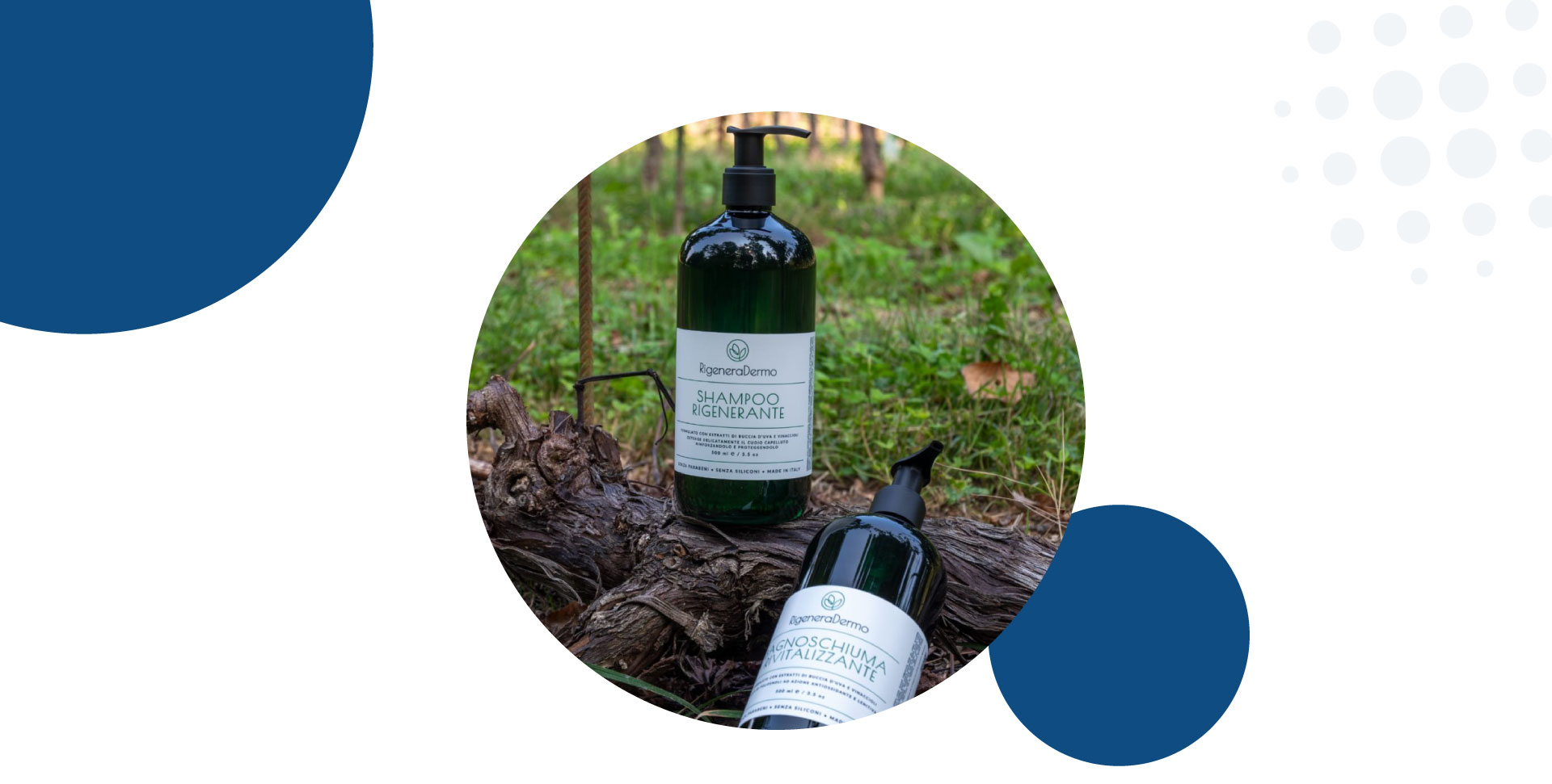
RigeneraDermo is a brand based in Veneto specializing in natural and eco-sustainable dermocosmetics. Its product line is born from the recovery and regeneration of grape pomace from local viticulture, transformed into innovative ingredients rich in antioxidant properties.
Logo development and creation of the Corporate Brochure
MISSION
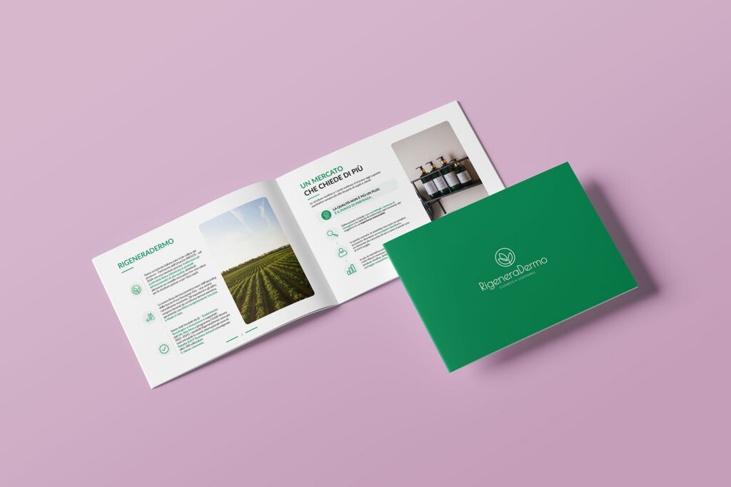
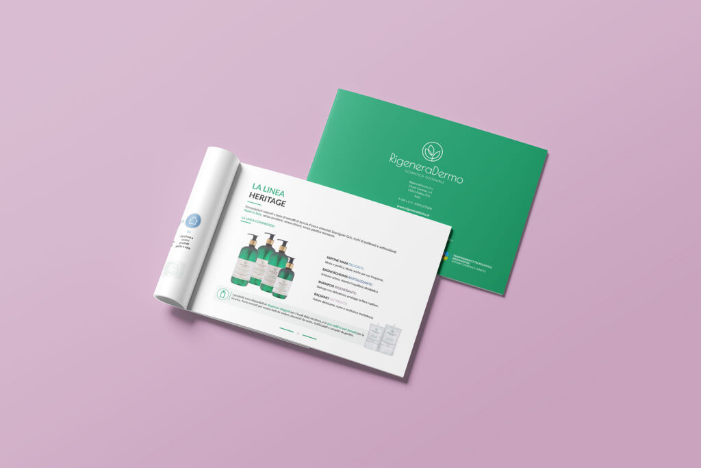
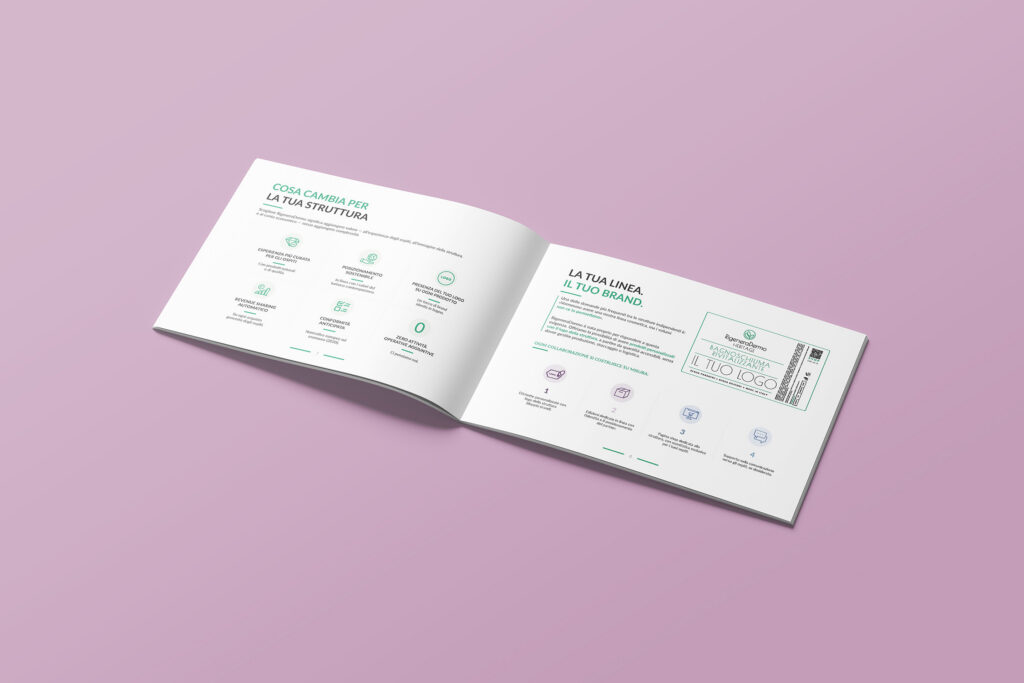
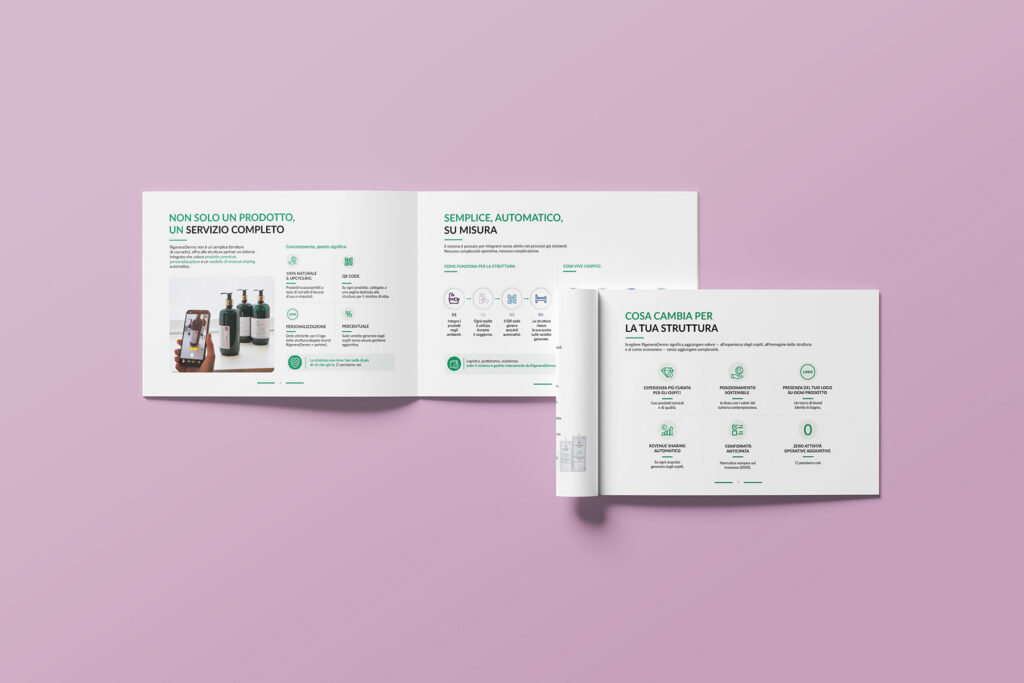
Comunicazione 21 oversaw the study and creation of RigeneraDermo’s logo, developing a visual identity capable of conveying the brand’s values of sustainability, innovation, and connection to the local territory. Inspired by nature, the design clearly communicates the essence of the brand. Building on the new visual identity, we also designed and created the company brochure, structuring and enhancing its content to present the company, its values, and its offering in a clear and cohesive way.
SERVICES PROVIDED
1- Color study
2- Logo design
3- Graphic design
4- Content design
5- Content strategy
CREATION OF RIGENERADERMO LOGO:
from color and font study to the concept
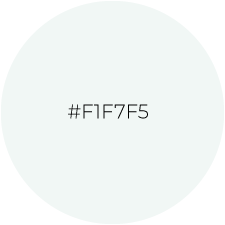
SELECTED COLOR PALETTE


SELECTED TYPOGRAPHY
Logo – Poiret Regular
RigeneraDermo
LOGO CREATION
Overview

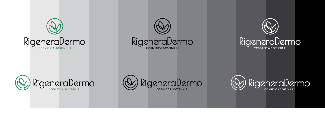
Background management
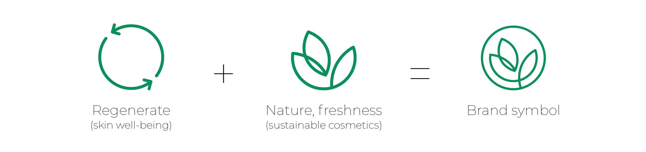
Concept Studio
Favicon and Submark

CREATION OF RIGENERADERMO’S BROCHURE:
from graphic design to content creation
SELECTED COLOR PALETTE
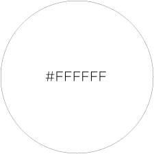

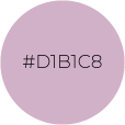
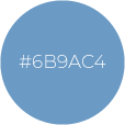
Secondary palette (some icons and elements)


SELECTED TYPOGRAPHY
Headline – Lato Bold
NON SOLO UN PRODOTTO,
UN SERVIZIO COMPLETO
Body – Lato Regular
RigeneraDermo non è un semplice fornitore di cosmetici, offre alle strutture partner un sistema integrato che unisce prodotto premium, personalizzazione e un modello di revenue sharing automatico.
BROCHURE DESIGN