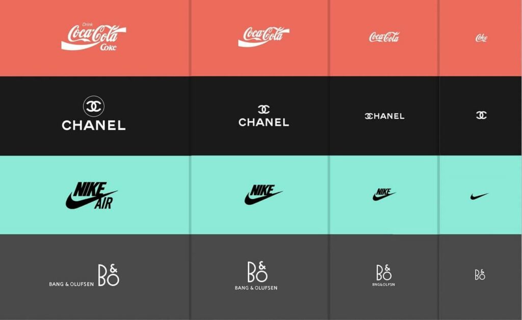
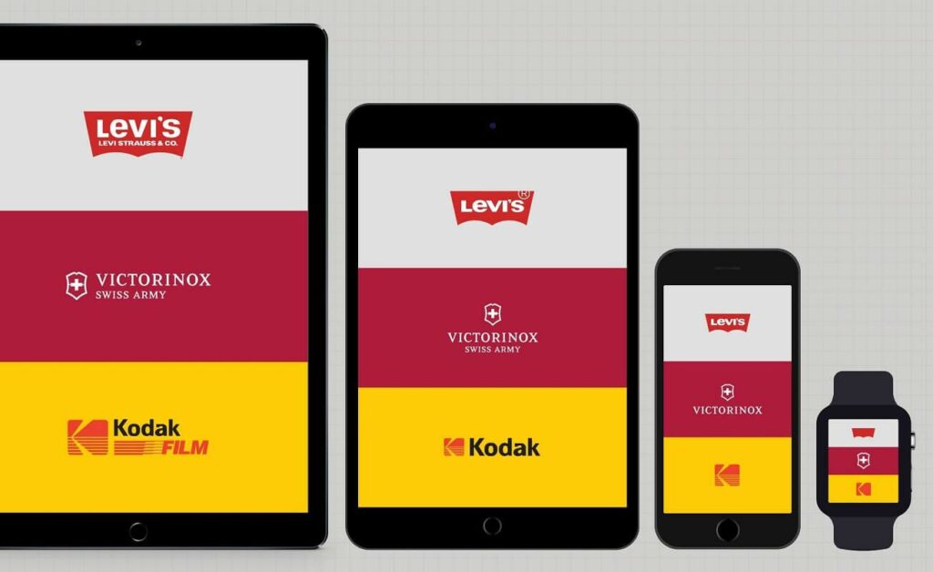
Ever heard of responsive logos? Many companies today (from multinationals to small businesses) are understanding the importance of adapting and making their image consistent with every available medium. In a world where screens come in all shapes and sizes, adapting your logo can’t just mean zooming in or out. There is a need for responsive logos that can make the use of any portion of the screen elegant and efficient while remaining effective and recognizable.
THE HISTORICAL UNTOUCHABILITY OF LOGOS

The real thing to be undone, is the approach to design had until today. For decades, corporate identity has been seen as something sacred, based on the idea that a brand should be recognizable as always the same: from TV advertising to street signs, a logo must not be touched, adapted or modified. Needless to say, today this reasoning no longer makes sense.
Think of Adidas, Nike or Puma. The truth is that anyone would be able to recognize these brands, both in their textual version, graphic, or in the combination of the two. The historically “sacred” concept that wants a company’s logo as a rigid form, which must never change, is giving way to greater freedom. Just like humans, logos don’t look the same every day. They don’t have to be afraid to evolve and adapt to the context.
HOW TO CREATE A RESPONSIVE LOGO

There are many ways a designer can make a logo responsive. But the simplest and most intuitive is definitely to start from the main logo, analyse the elements that it is made up of, and move or use more or less of these elements as the orientation of the screen changes or the space becomes larger or smaller. Most of the time there is nothing new to invent, just make the best use of what already exists.
Another technique may be to maintain the main appearance and composition of the logo, but by removing details and redesigning the structure as the size of the logo decreases, keeping it visible, Pleasant and recognizable even on the smallest screens. Animation can also play an important role: just think of a loading page (the one where the classic “circle” of buffering usually appears) or an emotional video. In these contexts, having a logo that can be animated can really make a difference in terms of brand awareness.
If you want a modern logo, adaptable and able to really communicate the value of your brand, contact us to discover our services of logo design, brand development and coordinated image.
LESS IS MORE!

Apart from the psychological obviousness, according to which the human brain remembers simple and immediate figures much better than complex compositions, even the time in which we live leads in this direction. Users (people) are becoming more lazy, pay less attention and it is therefore necessary to simplify and propose logos that are easy to understand and suitable for mobile.
Removing more than adding, simplifying, making the logos more linear and accessible is the first step. A path already taken by many digital giants such as Google, Facebook and Instagram, which have greatly reduced the “complexity” of their logos. Once a logo is made accessible, it will also be much easier to make it responsive and adapt it better to the context in which it is located.
This article is inspired by Responsive Logos, a very interesting experiment proposed by the English designer Joe Harrison. All image rights reserved to him.
Does your logo really communicate who you are, on every device and in every context?
A responsive logo is not just an aesthetic issue: it’s a strategic tool to strengthen your brand identity and ensure visual consistency across all channels, from the website to social media. If you feel that your image can be improved or you want to start off on the right foot, contact us to find out about our logo design, brand development and coordinated image services. We’ll help you create a strong, professional visual identity that will stand out in every situation.


